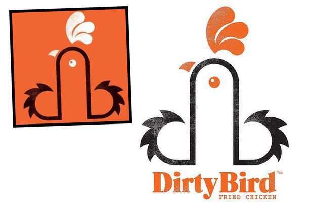
Food Company defends its controversial new logo after customers complain about its phallic and unusual design reports Walesonline.co.uk
The owner of the Dirty Bird Brand has stated that the logo was just a unique way to change the "B" and the "D" look like a small rooster. We have a "hard" time believing that.
The food company has also started using posters that state " Touch My Thigh" and "Touch My Breasts". Great wordplay if you ask me. Although, Dirty Bird owner Neil Young has backed his statements that these were not meant to be obscene.OK, I'm with LockerDome. Maybe Dirty Bird isn't trying to be obscene, but that is just semantics -- those guys sure as hell know what they're doing and are trying to be as close to the edge of obscene as they can get. Doubt it? Check out another one of their advertisements:
Yeah, just another fried chicken place, trying to make it in a competitive market. Fucking hilarious.


No comments:
Post a Comment